When the weather cools and leaves start falling, the Valley’s colours change and we change in response. This can be internal, governed by our emotional response to colour and to light, and it can be external – a gentle shift in decor treatments around our home, to reflect the seasons.
I spoke to design consultants Zoe Quirk and Amanda Grace about colour – how they’ve worked with it in their different fields and how they use colour in their own homes and with clients.
Before moving to Kangaroo Valley, Zoe Quirk had one of my fantasy careers: she was Visual Merchandising Manager at David Jones. This is a role where skills in teams-coordination and planning are crucial as you work from your floor plan, with teams of buyers, merchandisers, the dock, sales teams, marketing and often builders so that the space looks enticingly “shoppable”, says Quirk.
“Take everything out of the store except the escalators. That all has to go back in…from that empty space to the experience the customer walks into.” Not just the windows on the street but the whole store experience is carefully considered and planned and workshopped and re-planned, and then finally implemented, often months in advance. Christmas and Mother’s Day are two big ones – both of them containing a huge range of different types of stock, different shapes, and styles to appeal to an array of different tastes. It’s the job of Visual Merchandising to weave it all together.
“Mother’s Day hits the whole store and it crosses over even into Menswear – which I know seems a little bit bizarre but we try to hit everyone up for Mother’s Day,” Quirk says with a cheeky laugh. “So Mother’s Day’s in May [and] the conversations start in about February.”
As the VM team, led by Quirk, worked installing women’s sleepwear windows, and sumptuous display tables of cookbooks, mugs, and other products customers would be seeking, they were all working to a “[design plan] that’s been put together, with colour and texture, to make you want to buy something”. Design education on board and an instinctive eye for “happy accidents”, VM Managers bring products together, using form and height, texture, and colour, in pairings to catch the eye. To be clear, it’s not just the ideas that are locked in, it is the plan in its minute detail. While Quirk was liaising with all the different departments involved, and preparing whole window displays behind the scenes to be seamlessly moved into position without the customer noticing (mannequins dressed and posed, garments steamed and pinned, furniture arranged – all of it!), she was also already contemplating Christmas, working on the various seasonal merchandising involved in-between, problem solving “dead” spaces, and planning, installing and uninstalling a parade of one-off events.
“It’s all very cloak and dagger [and] voilà – the blinds go up and it’s all there [in the window]; meanwhile, you’re running a marathon… I remember we had the Kardashians in but the Today Show were coming in the next day [for Christmas] so we had to have Santa’s Grotto ready as well… 1000 people in store [for the Kardashians] but we had to have Santa’s Grotto all set up by the end of the day.”
So it’s not a 9 to 5 job? “[N]ot at all – I remember a lot of Sundays outside a window with a walkie talkie: ‘Need to move her to the right; she’s not drilled in; her finger’s facing the wrong way.”
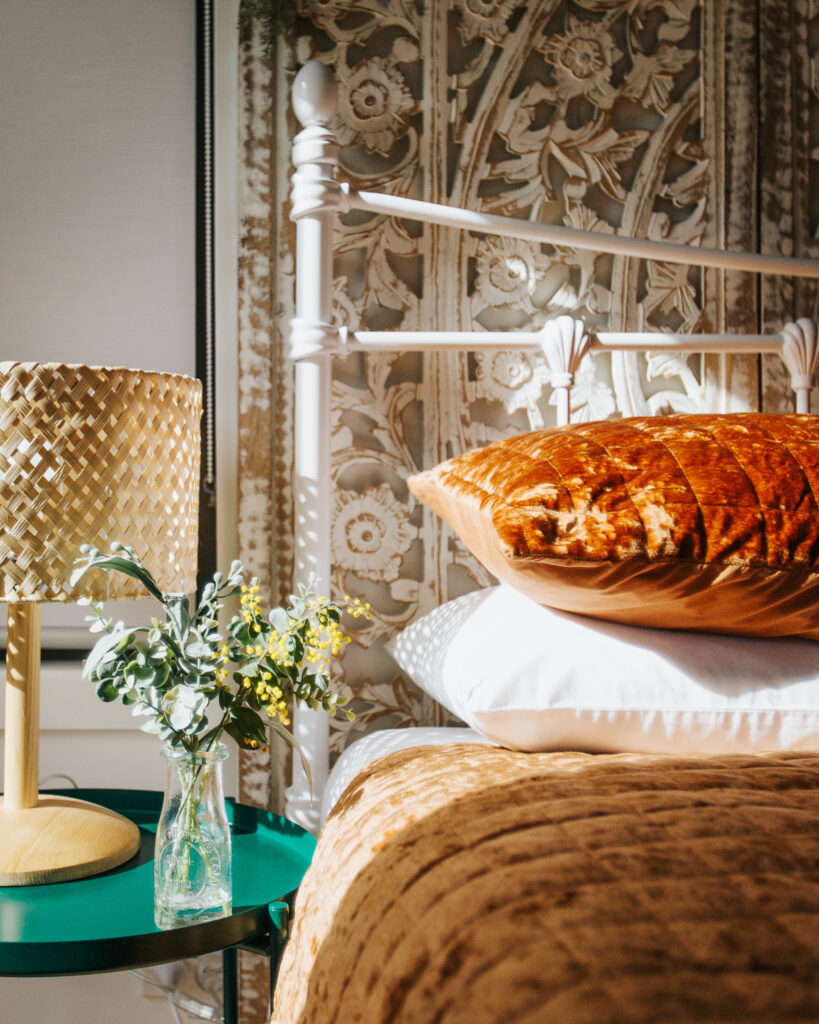
I ask how important colour is to Quirk, personally. “Colour to me is life!” she says. “It changes everything.” She describes her style for her own home’s interior as “Maximalism with nostalgia,” joyfully confessing to a pared-down dozen cushions on the bed. “Family heirlooms and trinkets you pick up on your travels, all those sorts of things, they have meaning. I don’t hide them in a cupboard – I mean, that’s essentially your home’s DNA.”
When she’s working with clients she takes cues from their personal style, whether clothing or clues in the homewares and what they get excited about in discussion. “We’re all different,” she says. “When I enter a home, I’m looking for the person.” Quirk believes home should be a sanctuary where we can let our personal quirky bits show, but some lack the confidence to do that. And few people are brave with colour.
Amanda Grace, of Sydney Design School and Interior Design Online, has experienced people’s nervousness around using colour, too. This is one of the reasons she added the short course Colour to the certificate and diploma courses. Developed by professional colourists, the course covers the foundational aspects of designing with colour, from knowing nothing to the finer points of colour for spaces, including interior and exterior paint specifications and finishes. It’s for anyone who wants to learn how to make informed design decisions on colour. (I’m realising there’s an awful lot more to designing with colour than I’d thought.) Meanwhile, design professionals can deepen their colour expertise with a 12 week course covering new innovations and trends in colour and finishes. When Sydney Design School started, many of the students were mature age but now, she says, they’re enrolling mainly younger people.
Grace’s own design work is at the interior architecture end of things, “much more the space planning, moving walls,” and she tends to bring a Colourist in to work with her and the client.
“I’m not a Colourist but I love colour,” Grace says with passion. “I can select colours quite innately. Some people need to learn it and other people have a real sense of colour, their own colour, and actually most of it’s about confidence and having the confidence to go for it …when you learn the theory of colour it gives you that confidence.” But sometimes, she says, you’ve got an idea of something that will work and you’ve just got to go for it.”
“When we teach colour we often develop palettes from things like nature. We have our primary colours, your basic colours, but all your tertiary colours are your rusts and your greens and often we can find that palette in nature and that’s really what we do in our course is get you to look what’s out there and gather things so you can really replicate what we can see in the environment. And the tertiaries are beautiful, and very on trend at the moment – you know the rusts, and the terracottas, and the greens.”
Quirk, too, loves to bring the outside inside. “I have to have fresh foliage in the house all the time [and] I have plants around the home as well. Whatever’s available – a thistle on the side of the road, if that speaks to you. It doesn’t have to be an expensive vase, just one you like from the op shop.”
She will redecorate a little with the change of seasons. “We put more on in winter…and I do the same in the house: put more throws around, cosy it up a little.” Then does she remove that for summer? Quirk laughs, “Ha, well summer’s a bit different because I start decorating for Christmas in September.” I ask if that’s the visual merchandiser coming out. She says she might go a bit over-the-top, but she’s not the only one, telling me she has a friend who also installs trees, plural, for Christmas.
Grace doesn’t really change much for the cooler months, since her home anyway is decorated with dark fabrics and furnishings inside white walls, choosing colours that make the most of all the different greens through the window. She might bring in darker throws to complement the furnishings. “I just love that depth of warmth that a deep colour brings.” At some point we talk about the still-continuing trend of dark décor, and single-colour dark rooms. I’ve seen a number of dark kitchens I say.
“Ooh, I love a dark kitchen!” Grace says. “Give me a dark green kitchen any day.” I think of the kitchen a woodworker friend has built, to a bespoke design in timber and black Paperock (a construction material made from layered paper and resin). The bush through the window behind it just sings.
Remembering the branding workshops undertaken in the Valley several years ago, and the discussion then of a colour for Kangaroo Valley (and with our own new masthead in mind), I ask each of them: what is the colour of Kangaroo Valley? “Virid,” says Quirk, “viridity green. For me, the green here –when the light hits it, it goes fluorescent. I’ve never noticed that anywhere else.”
“It has to be something that complements green,” Grace muses, and I’m not surprised: she has such a passion for green, especially olive greens at the moment, she says, and speaks fondly, as so many do, of that moment coming down the mountain, when we glimpse the green bowl of the Valley. “We’re surrounded by green so we almost have to have an opposite…unless we go for…an apple-ey sort of green…probably …light rust would be my colour for K V.”
The Valley has always been synonymous with rich autumn colours for her. “I can’t wait for the leaves to line the pavement: you know, all of those ochres, yellows, all of those autumn colours. I really think that’s the Valley at its best.”